When bringing an architectural project to life, there is an invisible yet powerful element that goes beyond form and function: color. The right color palette is not merely an aesthetic choice; it is a strategic decision that influences human psychology, defines a space’s identity, and shapes the user experience. 3D architectural visualization is the most powerful tool for testing the impact of colors on a space before committing to critical decisions.
Why Is Color So Important? The Science Behind It
The impact of colors on human behavior and emotions has been recognized for centuries. However, for modern architectural projects, this knowledge is no longer just theoretical—it has become a completely measurable and applicable tool.
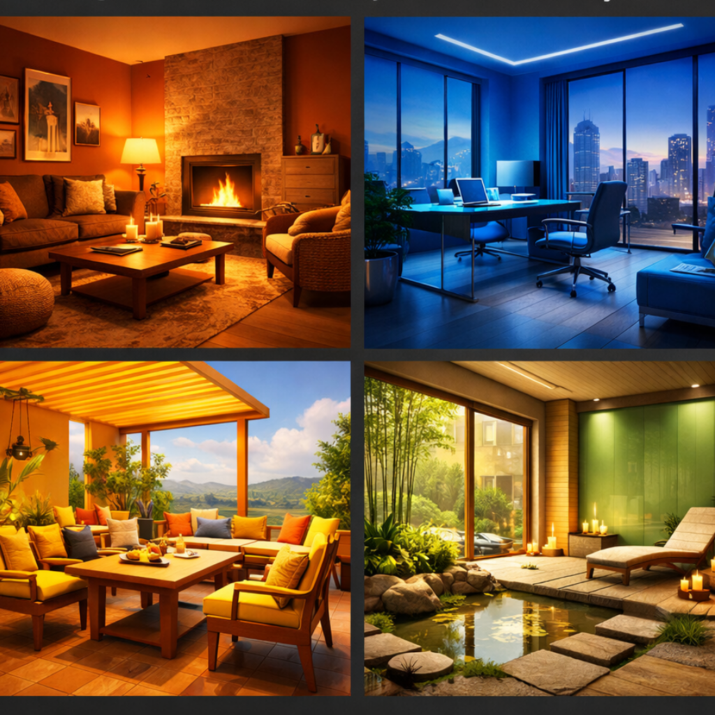
Research shows that colors affect our heart rate, attention span, and even our decision-making processes. For instance, blue tones create feelings of calm and trust, while red tones evoke energy and urgency. Therefore, the color palette used in an office project should be completely different from that used in a spa center.
The Role of 3D Rendering in Color Decisions
In traditional methods, seeing the effect of a wall color on a space required physical paint samples or imagination. However, these approaches were both costly and potentially misleading. This is precisely where photorealistic 3D rendering steps in and changes the game entirely.
1. Testing in Real-World Conditions
With 3D visualization, you can see a color palette not in isolation, but exactly as it will appear with the project’s lighting conditions, materials, and surroundings. You can observe how natural light behaves at 9 AM, what atmosphere it creates at sunset, or how colors transform under artificial lighting.
This ensures that your clients, investors, and team all share the same vision. No surprises, no disappointments.
2. Fast and Cost-Effective Alternative Scenarios
In the physical world, a color change means repainting, sourcing new materials, and wasted time. In the digital world, it’s just a matter of a few clicks. You can compare different color palettes, material combinations, and texture options within minutes, identifying the option that creates the strongest emotional impact.
This flexibility makes the design process not only faster but also far more creative.
3. Building Client Confidence
Instead of telling a client “This color will be great, trust me,” you can say “Here’s exactly the atmosphere this color palette will create in your space.” Photorealistic rendering appeals to your clients’ eyes, not their imagination. This significantly increases their confidence and commitment to the project.
Color Strategies for Different Space Types
Every project has its own unique color language. Here are strategic color approaches for some common project types:
Residential Projects: Warm, inviting tones—beige, earth tones, soft greens, and pastel blues. Goal: To strengthen the “coming home” feeling and create tranquility.
Office and Commercial Spaces: Neutral, professional palette—white, gray, navy blue, and vibrant accent colors for emphasis. Goal: To enhance focus and communicate professionalism and trust.
Restaurants and Cafés: Bold, appetite-stimulating colors—warm reds, orange tones, deep wood tones. Goal: To encourage social interaction and create energy.
Healthcare and Wellness Spaces: Calming, natural tones—light blue, green, cream, and white. Goal: To convey feelings of peace, trust, and healing.
The Light-Color Relationship: The Digital World’s Advantage
The perception of a color depends on its interaction with light. The same color can look completely different under different lighting conditions. 3D rendering technology can simulate this complex relationship flawlessly.
You can visualize your project at different times of day, test the effects of natural and artificial light sources, and even examine how the space looks under various weather conditions. This level of control and foresight is never possible with traditional methods.
Ideal Applications: Which Projects Benefit Most?
Color psychology-focused 3D visualization is critically important for these project types in particular:
- High-Profile Residential Projects: Every detail must be perfect to meet the expectations of luxury buyers.
- Brand-Identity Commercial Spaces: Color is the visual expression of a brand’s DNA.
- Public Buildings and Educational Institutions: The impact on human behavior and well-being must be considered.
- Hotel and Hospitality Projects: Customer experience is directly shaped by atmosphere.
Conclusion: Color Is Not Just a Detail—It’s a Strategy
Color selection in architectural projects is not merely an aesthetic choice; it is a strategic decision with psychological, functional, and commercial dimensions. 3D architectural visualization is the only way to make this decision consciously, confidently, and effectively. It allows you to offer your clients not just a building, but an experience, an emotion, and a lifestyle.
Contact us to learn more about our photorealistic 3D visualization services for your project and to create the space of your dreams together.
[…] Visualization Is Risk […]